Your Cart is Empty


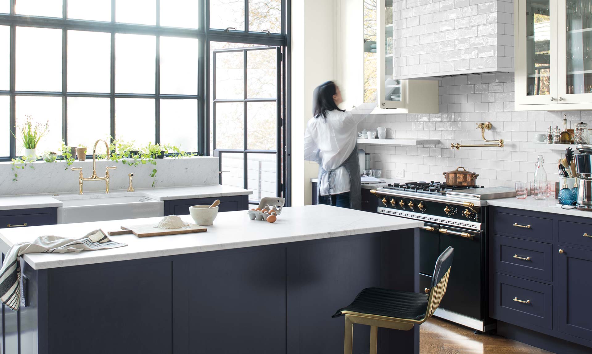
To some, the recent announcement that Metropolitan AF-690 was chosen as Benjamin Moore’s Color of the Year came as a bit of a letdown. We had just come off the year of radiant Caliente AF-290 a feisty firecracker filled with surprise and energy – only to learn it had been replaced by a stylish gray with sophisticated blue undertones.
Needless to say, some of the reaction to the news has been, well,coolish.
“Where’s the bold? Where’s the daring?” the underwhelmed have lamented. “Where is the sexy that will whisk me away on the heart-racing adventure of a lifetime?” (Okay, no one actually said that, but you get the point.)
Don’t get us wrong, Metropolitan AF-690 is perfectly lovely. It’s a very nice neutral. It’s a safe and comfortable choice. But you don’t have to ask Dr. Phil to realize that there’s a time for nice and safe, and then there’s a time to throw caution to the wind and flirt with something darker and dangerous.

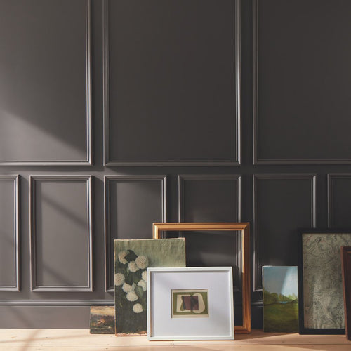
So for those left wanting for more from their Color of the Year – allow us to point you in the direction of the deep end of the Color Trends 2019 Palette. Say hello to: Hunter Green 2041-10, Hale Navy HC-154, Head Over Heels AF-250, Beau Green 2054-20, Kona AF-165, Kendall Charcoal HC-166, Black Pepper 2130-40

Complementary to Metropolitan AF-690 and yet, powerfully alluring on their own, these bad boys offer a more bold and saturated option for those seeking some unadulterated color in their life.
If you have the courage to add a darker option to your home decor, designer-of-our-dreams Candice Olson offers some great advice.
“For those not quite as adventurous with bold color, you don’t have to paint an entire room. Bring in one boldly-colored accessory, fabric or rug. It’s often an easier way to incorporate bold color without going over the top or making a mistake,” Candice says.
“Powder rooms are typically small and a great place to experiment with a bold color on the wall. Justdon’t paint your powder room green because it can cast a sickly green tone in the mirror and you (or your guests) will always have an ‘off’ look.”


Here are a few more tips and tricks for bringing home the bold:

For 50 years, Benjamin Moore's Historical Color Collection has brought the character of 18th- and 19th-century design into modern homes. From the quiet confidence of Stonington Gray to the bold statement of Heritage Red, these are the shades that never go out of style. Take a look back at where the collection began, and discover the ten colors still shaping homes today.

Discover Raindance 1572 from the Benjamin Moore Color Trends 2026 palette. Explore pairing ideas, similar hues, and expert color guidance from Colorize, your trusted Benjamin Moore dealer in Clifton Park, Queensbury and Niskayuna, NY

Explore Southwest Pottery 048 from the Benjamin Moore Color Trends 2026 palette. Discover pairing ideas, similar hues, and expert color guidance from Colorize, your local Benjamin Moore dealer in New York’s Capital Region.