It’s time to get over gray, beige and for goodness sake, griege. As the much buzzed-about 2020 Color Trends palette from Benjamin Moore shows, there are more inspiring neutrals to explore.
But first, let’s address the pink elephant in the room: that the Color of the Year, First Light 2102-70 is, well, pink. Understandably, the choice is not sitting comfortably with everyone, especially homeowners resistant to putting a soft, rosy hue on the walls.
Yet, put on rose-colored glasses and view First Light not as pink but as “the backdrop for a bright new decade,” and you might begin to see things differently.
“It’s something you can really live with day in and day out,” pointed out Andrea Magno, Benjamin Moore Director of Colour Marketing and Development in Architectural Digest. “Even if you use it on all four walls, it’s enhancing the surroundings, pulling everything together. It’s not like, ‘whoa!’”
While traditional neutrals are great, Ben Moore pronounces that it’s time to bring color back into our living spaces in a way that truly transcends color.
“We selected First Light as our Color of the Year to represent a new dawn of idealism, design and living. It reflects a new definition of the home – a shift in mindset from the material to satisfying the core needs in life: community, comfort, security, self-expression, authenticity and ultimately, optimism.”
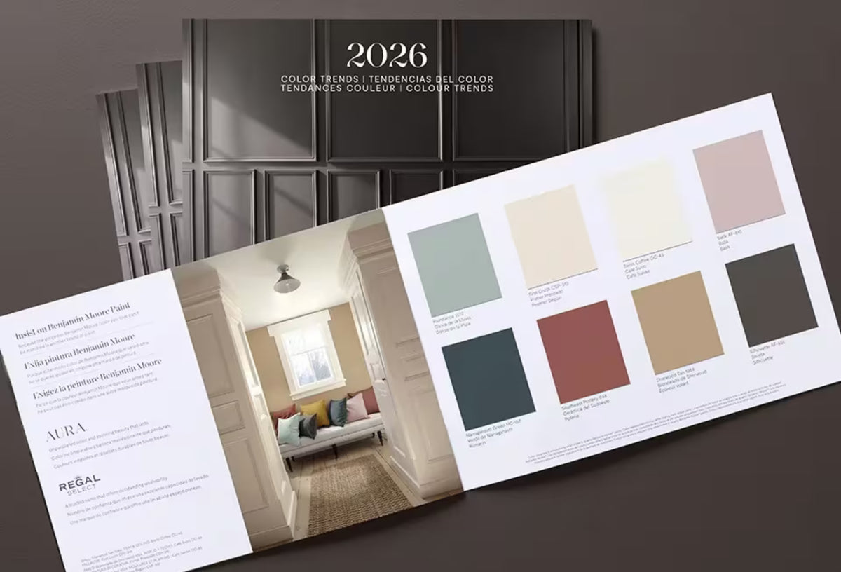
First Light 2102-70 is a flexible neutral that floats between warm and cool. It’s at the forefront of Benjamin Moore’s Color Trends 2020 collection, a palette of supporting players that each offer a timeless way to lighten up.
Look, no matter how we frame it, not everyone is going to love the Color of the Year – and that’s perfectly fine, admitted Magno. There’s surely something in Benjamin Moore’s 2020 Color Trends palette that will satisfy every discerning eye.
“Color is powerful but highly subjective, especially through the lens of different generations, relationships and moods,” she said. “But from the saturated to bright and airy, all are easy to live with and easy to love – whether they stand alone, in a strong pair or all cohabitate.”
Explore the entire 2020 Color Trends Collection from Benjamin Moore here, or pick up your sample of the 2020 Color of the Year at your nearest Colorize location.


