Which of these past picks stands out as your favorite?
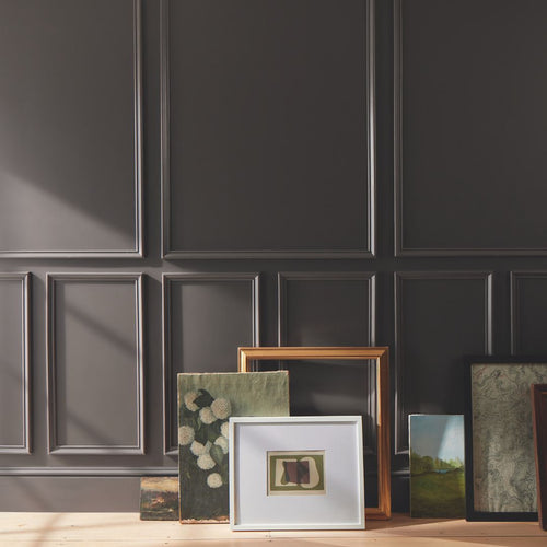
With Benjamin Moore’s 2023 Color of the Year being announced shortly, we’re feeling nostalgic about the choices unveiled in previous years . Each one perfectly captured the look and feel of that moment in time, reflecting the year’s global trends in art, fashion and interior design.
We’ve put together this blast from the past so we can take a moment to remember some of the superlative selections of the past. Be sure to come back and join us on October 12th to see this year’s crowning choice for Color of the Year!
2012

A classic that never goes out of style, this beautiful hybrid blue is versatile with universal appeal, working well in traditional, modern and even historic homes.
2013

This luscious yellow uplifts without being overpowering, complements almost any color palette, and provides a unifying element for diverse spaces.
2014

Reflecting the fresh color cues and pastel trends of the year, this gorgeous, ethereal blue serves as a "new neutral" that is both livable and functional.
2015

The color that ties things together, this silvery green works well with, everything. No worries. No second thoughts. Just a whole lot of harmony and happily ever after.
2016

More than a design trend, white is a design essential, and this color choice demonstrates how the popular neutral can be transcendent, powerful and polarizing at the same time.
2017

This moody and mysterious master of ambiance is a rich, royal amethyst that can fade into the soft lilac-grey of distant mountains or morph into lustrous coal.
2018

A confident color that is vibrant and full of richness, ravishing Caliente brings the heat while pushing us all to become bolder – in big or small ways.
2019

With its cool blue undertones, this sophisticated gray-blue babe is an understated yet glamorous gray that makes spaces feel serene and ultra-sophisticated.
2020

This fresh and luminous blush-pink stunner is soft and airy, bringing a revitalized spirit and rosy outlook that lifts the mood in a flirty, flattering way.
2021

An exceptional balance of blue, green and gray as inviting as Greece’s famous bluish-green sea, this soothing mid-tone washes over us with a sense of calm and casual elegance.
2022

A gently-shaded sage that feels right at home in both traditional or modern designs, October Mist anchors a bedroom, bathroom or dining room and breathes new life into architectural features.
Of all these amazing choices, which one stands out as your favorite? And don’t forget, if you’d like to dip your paint brush into any of these gorgeous colors, visit us in-store or online to order a sample.